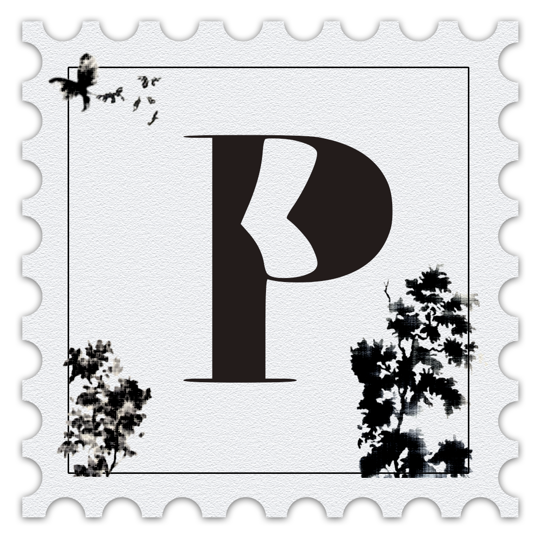
PECULIAR POINTS

I’ve always had a soft spot for serif fonts wth their versatility, their timelessness, and the way they can feel both classic and fresh. While working on this project, I set out to design a font that felt like an extension of me: structured, but a little offbeat. That’s how Peculiar Points was born. It’s grounded in tradition, like a serif should be, but with unexpected quirks that give it a personality all its own.